How do I edit titles, subtitles and text styles?
The Title & Subtitle element controls the main text on a screenshot.
You can use it to edit your screenshot captions, change fonts, apply rich text formatting, add backgrounds, adjust spacing, use gradients, add text decorations and control how the title and subtitle behave inside the text area.
To edit a title or subtitle, click the text directly on the screenshot. This opens the Title & Subtitle section in the edit panel.
Edit the title and subtitle text
Open the Title & Subtitle section to edit the text for the selected screenshot.
Depending on your layout, you may have:
a title only
a title and subtitle
different title/subtitle text for each screenshot
translated text for different languages
If you want AppScreens to suggest captions for you, use the AI stars icon in the Title & Subtitle section.
For more details, see How do I generate AI captions for titles and subtitles?
Rich text and inline formatting
You can format all of the text, or highlight specific words inside the text box and apply formatting only to those words.
Rich text options can include:
bold
italic
underline
colour
This is useful when you want to highlight one word, emphasise a phrase or make part of a caption stand out.
AppScreens also preserves inline formatting when replacing words, so styled text can keep its formatting when you update the wording.
Fonts and font family
Use Font Family to choose the font for your title and subtitle.
AppScreens includes over 1,000 fonts. You can also use the link icon to open Google Fonts and explore fonts in more detail. Use fonts consistently across your screenshot set so your design feels polished and on-brand.
Text colour and gradients
You can change the colour of your title and subtitle text.
You can also use gradient text styling when you want the text to have a more decorative or branded look.
Gradients are useful for:
hero-style headings
colourful app branding
promotional designs
making key text stand out
Text decorations
Text decorations let you add extra visual styling around your title or subtitle.
Depending on the selected style, these can include decorative previews such as laurels or other text decoration effects.
Use decorations sparingly so the text remains easy to read.
Text size
AppScreens can automatically size text to fit the available space inside the title element.
The most important text sizing options are:
Match to smallest Title Size
Keeps titles visually consistent across screenshots by matching them to the smallest title currently displayed. This is recommended for most projects, especially when working with multiple screenshots or languages.
No / Manual control
Lets you control the maximum font size manually instead of matching other titles.
Max Text Size
Sets the maximum size the title or subtitle can reach. The text may still appear smaller if there is not enough space inside the title element.
If your text looks too small, you may need to increase the size of the title element itself, not just change the font size setting.
For more details, see How do I change the size of my title and subtitle?
Title and subtitle ratio
The Title Ratio controls how much of the title element is used by the title compared with the subtitle.
For example, if the title ratio is set to 70%, the title uses 70% of the available text area and the subtitle uses 30%.
The font size is calculated based on the space available inside the title element.
Title to subtitle padding
Title to Subtitle Padding controls the space between the title and subtitle.
Increase the padding to create more separation.
Decrease the padding if you want the title and subtitle to sit closer together.
Line breaking
Line breaking controls how longer text behaves inside the title element.
Break / Wrap
Moves text onto a new line when it reaches the available width.
Single line
Keeps the text on one line. If the text is too long, AppScreens reduces the font size so the text can fit.
Use Break or Wrap for longer captions. Use Single line when you want a short caption to stay on one line.
Character spacing and line height
Character Spacing controls the space between letters.
Line Height controls the vertical spacing between lines of text.
Use these settings to improve readability, especially when working with larger titles, multi-line captions or decorative fonts.
Text background
You can add a background behind your title or subtitle to help the text stand out. You can add a text background to all of the text, or highlight specific words inside the text box and apply formatting only to those words.
Text background settings can include:
background colour
background padding
separate X and Y padding
line height adjustments
Increasing the padding makes the background larger around the text.
Separate X and Y padding gives you more control over the horizontal and vertical space around the text.
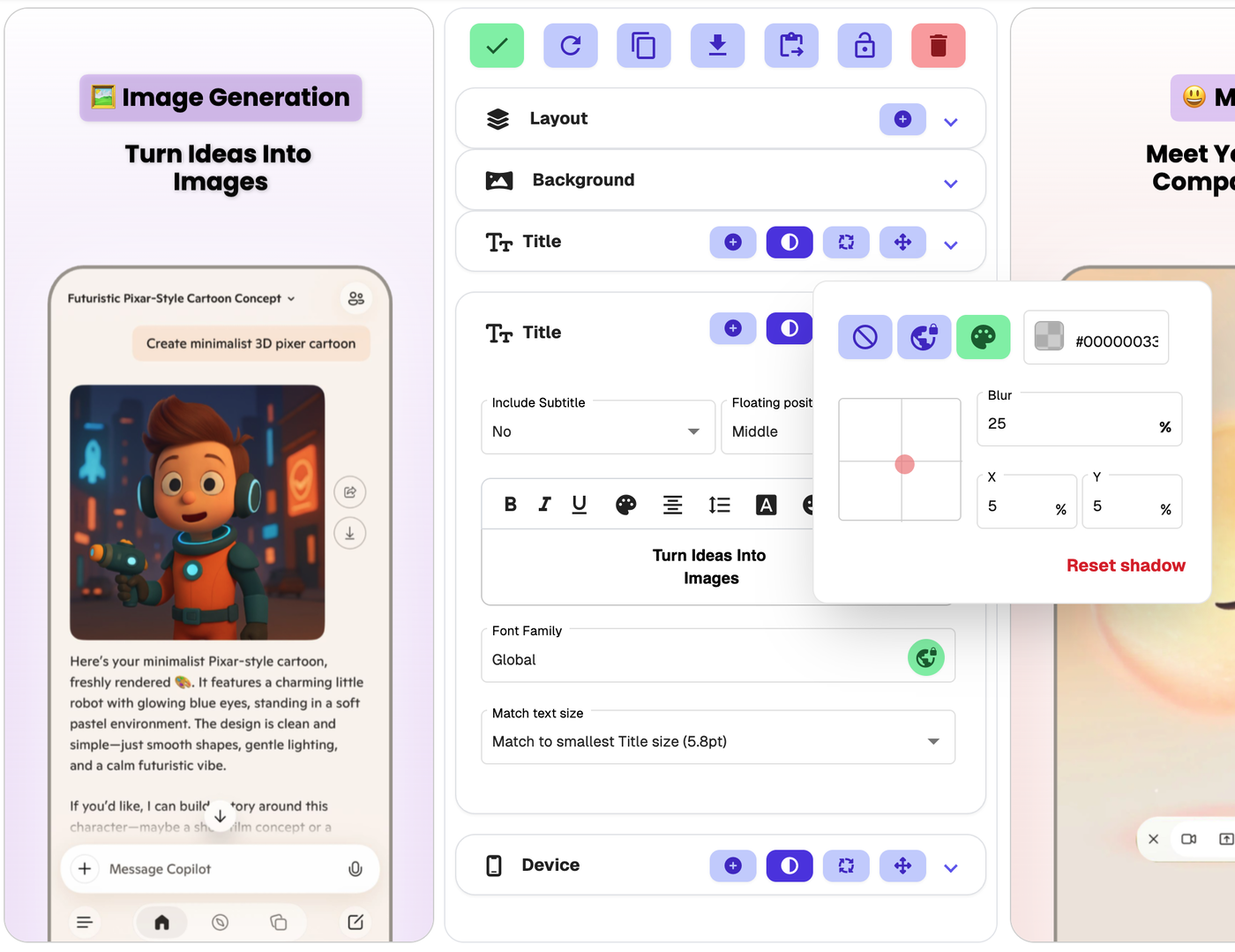
Shadow
Use Shadow to add depth to your title or subtitle.
A subtle shadow can help text stand out from busy backgrounds or image-heavy designs.
Rotation
You can rotate the Title element from the edit panel or in drag-and-drop mode.
To rotate from the edit panel, open the Title or Title & Subtitle tab and click the rotate icon next to the element heading.
To rotate visually, enter drag-and-drop mode and use the rotate handle above the selected title element.
Use rotation carefully so your title remains easy to read across all screenshot sizes and languages.
Moving or resizing the title element
The Title & Subtitle settings control how the text looks inside the title element.
If you want to move or resize the title element itself, use drag-and-drop on the canvas or open Exact Dimensions using the right-angle ruler icon.
Use drag-and-drop for quick visual changes. Use Exact Dimensions when you need precise control over position, width, height or spacing.