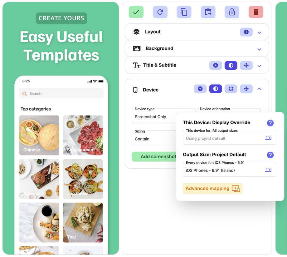
Device Element
Device Type
Select between many different types of device:
Dynamic Frame - select any frame & padding colour, select 5 different widths (this is our personal favourite frame as it has endless options!)
Flat Device Mockup - real dark, real light, real gold, matte light, matte dark
3D Device Mockup (right) / (left) - real dark, real light, real gold, matte light, matte dark
Screenshot only
3D Screenshot (right) / (left)
Device Orientation
Select portrait, landscape left or landscape right.
Rotation
Enter a rotation to add a little twist!
Device Fit
Contain - fits within the height and width of the element box.
Cover - the image will size to the full height OR width of the element box, whichever it hits first, covering the box and possibly overflowing in one direction.
Vertical Position
Select either Top, Center or Bottom, to position your device within the element box. This will anchor the device within the element box.
If your device does not move it will be because your device is already taking up the entirety of the element and you will need to either decrease or increase the element box size.
If you want to move your device around you will need to either click on the Move icon and edit the elements properties, or open the layout designer (see Layouts & Designer help pages for more help & how to).
Shadow
Add a shadow to your device to give it depth.
Edit Device
Use this to change the display device for the output size you are viewing. We recommend only using this for Android outputs and Custom outputs. Apple will reject your screenshots if they are the wrong device for the wrong output size (i.e. you use a Google Pixel 10 as your display device in the iOS Phones 6.9" output size).


