Creating, Reordering, Sizing & Editing Elements (Spacer, Device, Title & Image)
Your screenshot layer is made of 4 different elements
Spacer – A blank space for creating a space/gap between other elements
Device – A device frame (according to the target)
Title – A text element (and optional subtitle)
Image - Upload and place your own custom image files, such as logos, icons, badges, or graphics
Editing elements in the designer
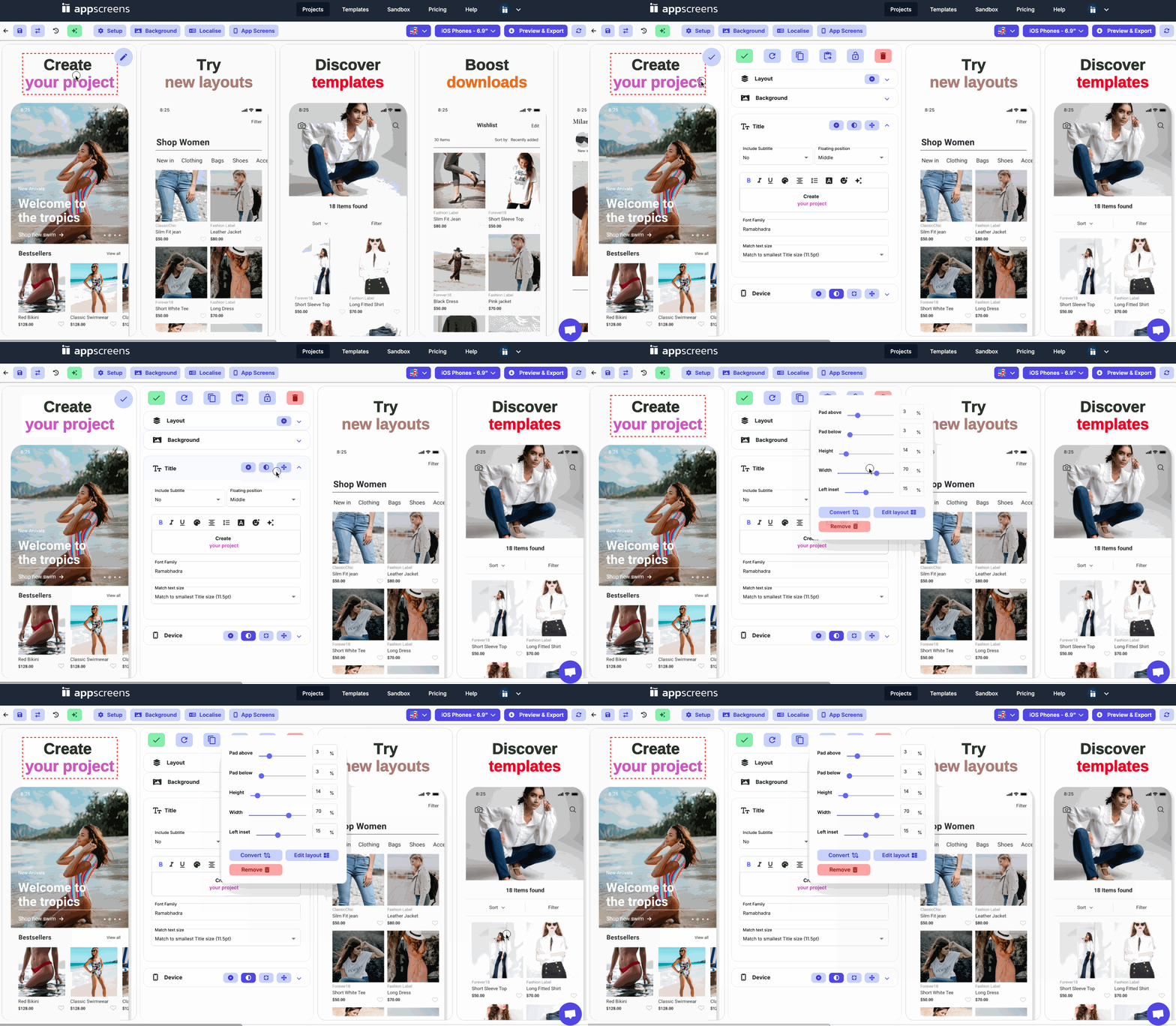
Against each element you'll see the move icon on the right hand side of the element bar.
Click on the move icon for basic element positioning
In the pop out you can edit the top offset, padding above/below the element, height of the element, width of the element & the left inset.
As you edit, you'll see your changes live

Adding new elements in the designer
Hover on the screen you want to edit
Click on the circular purple edit icon in the top right corner of that screen or click on an element
On either the Layout element or Image, Title & Device elements you'll have a + button on the element toolbar
You can quickly add a new element to your layout here
Select your Element Type - Title, Image or Device
Select your Location - Above this element, below this element, on a new layer
Select your Sizing - Squeeze elements to make room, or push elements down
Click Add element

Editing layout in the custom layout designer
Hover on the screen you want to edit
Click on the circular purple edit icon in the top right corner of that screen
Under the Background element tab
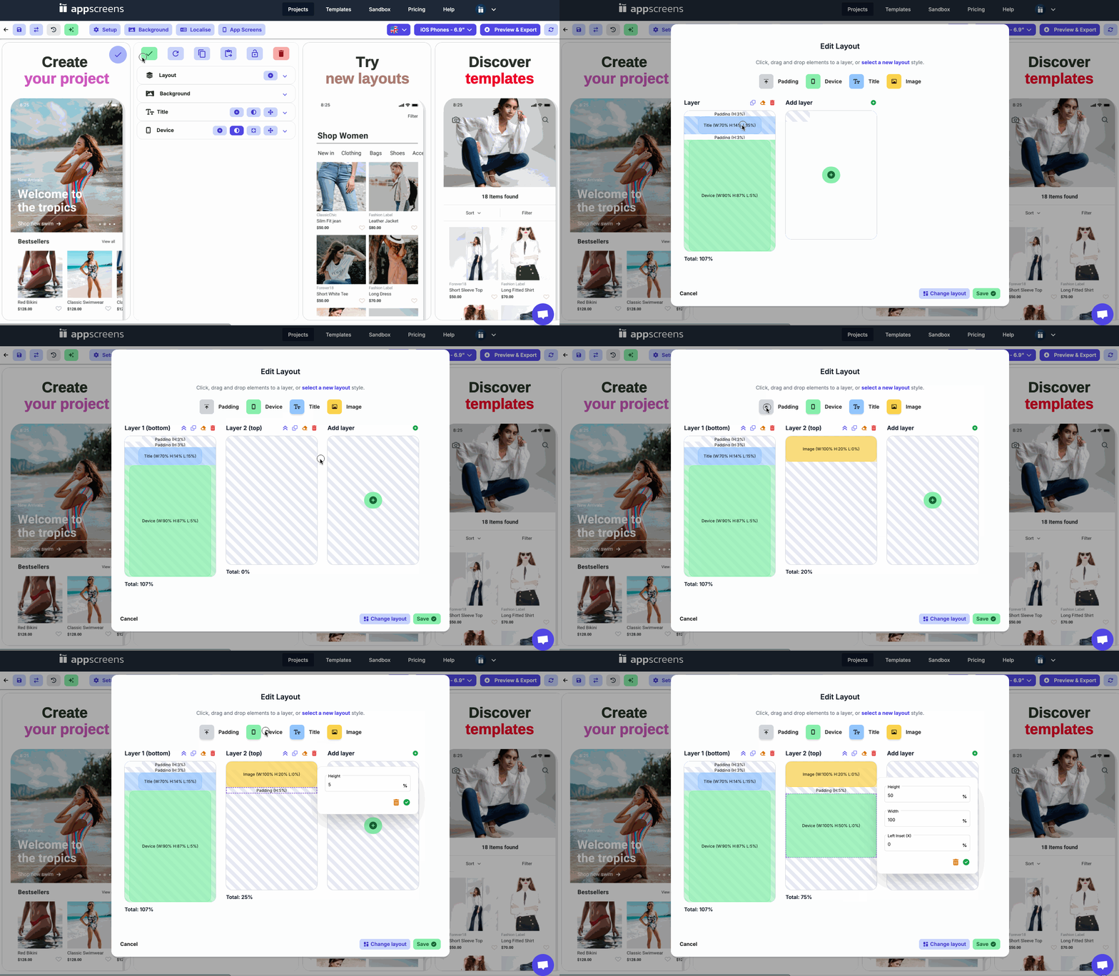
Click the Edit layout button
To add an element
Drag and drop an element from the element box into the screenshot layout.
To reorder an element
Drag and drop an element within the screenshot layout up or down to replace and move above/below other elements
Each Element is made up of ‘Height’, ‘Width’ & ’Left Inset’. The top element will also allow you to enter ‘Top Offset’.

Element Properties
Height
The height of your element
Enter in a percentage height for your element. This will be how much of the screen this element will take up, this is also how much space that element will have to sit within. For example, Spacer H 5%, Title H 10%, Spacer H 5%, Device H 78%, Spacer H 2%
Width
The width of your element
The width will automatically be added as 100%. This means the element will span across the whole width of the screenshot from edge to edge.
Generally, we want elements to be positioned in the center of our screenshot and not touching the edges! See the width measurements of Full Device – Text Top as an example, where the ‘Title’ Element is 80%
Left Inset
The percentage of inset applied from the left (at 0%)
0% is the left side, 100% is the right side. If you make your element i.e. ‘Device’ a width of 80%, you will need to also ensure it has a left inset of 10% (10% for the left, 10% for the right) so that it sits in the center, otherwise it would sit between 0-80% on the left of the screen.
Top Offset
Where your first element starts
If you want all elements contained within the screenshot, all elements would be no less than 0% and no more than 100%, when you enter numbers over or under this, they will be placed partly off the screen
If you’d like your device to hang over the top edge you would enter in a top offset such as -10 so your element starts at -10% and the first you see of the element is at 0% (see Part Device – Text Bottom for an example)

